Calpak: Reorganizing the Luggage Experience
Website Redesign
Overview
My goal for this project was to identify where Calpak had opportunities to improve their website design for their customers.
I had in-depth conversations with users about what they look for in an online shopping experience for their travel bags and accessories. I took that data and tested their current website and 3 new prototypes to determine how Calpak can make the biggest impact for the lowest cost.
The end result was a mid-fidelity design with a reworked, unobtrusive navigation that let users find what they were looking for and feel confident in their purchase.


My Role: Lead Designer
I was responsible for all phases in the design process.
Tools
Figma
Figjam
Methodologies
User Interviews
Design Studio
Prototyping
Usability Testing
Unpacking The User’s Needs
I interviewed five users about their experiences with packing and purchasing luggage.

The Problem
It’s About The Essentials
Travelers need a reliable way to learn about a piece of luggage´s qualities (no frills, well organized and lightweight, durable, waterproof, with many compartments) so that they can confidently choose the best piece of luggage for their needs among a variety of options.

To guide me through the next phase of my project, I developed a persona. “Taylor the Traveler” has her own story and reasons for why she travels. I thought about Taylor throughout the design of this project and thought “Would doing this to my design help Taylor?” whenever I made design decisions.
Keeping The User In Mind While Designing
Users loathe reading dozens of customer reviews.
Users also hate it when they don’t get the features they expected.

Addressing Discomfort And Confusion
“I would not want to stay on this page too long.”
“Why is it divided in half like that? It’s so weird.”
Evaluating Calpak’s Website
I assessed the functionality of the Calpak website by having two users to complete a task. The task was to find a marble colored carry-on bag.

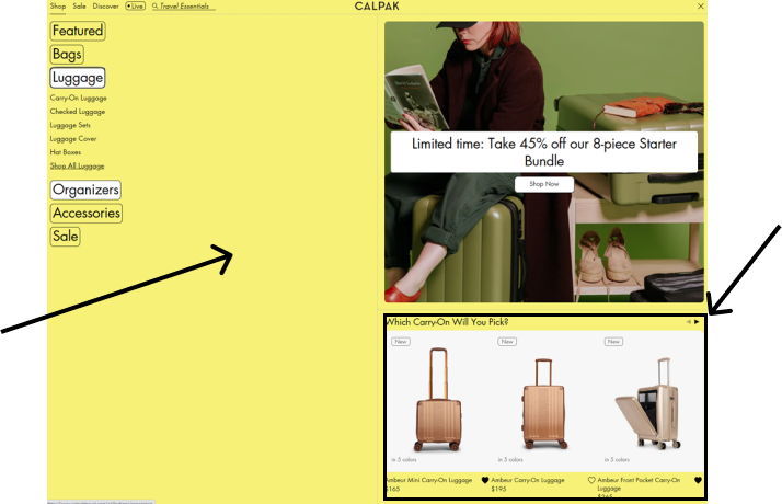
“I don’t know why this is sideways.”

When selecting the filters, options are limited and don’t include all color option in their catalog. Users could not find any category labeled “Marble.”
Planning The Next Trip
Strategy For A Smooth Shopping Experience
Current users are overwhelmed and confused by the current website. I started brainstorming ways for how I might approach the problem.
How Might We...
Help users easily find a bag that suits their needs.

Simplify the navigation and guide the user to viable options.

Improve product filtering to show more options.

Reduce stimulation and keep the user comfortable and not overwhelmed.

Only Packing The Essentials
Travelers can learn about a luggage’s qualities and features through detailed descriptions.
Allow users to filter products by the features they think are most important like waterproof and type of compartment.
Putting Filters And Descriptions To Work
I quickly sketched my initial design ideas to maximize efficiency.


Neatly Packing
Carefully Organizing The Products
I asked 3 users to categorize 49 different products from the Calpak website.

I noticed that users categorized the bags by how they would use each bag for each occasion. This helped me decide how to organize the primary navigation.
Checking Bags
Usability Testing Round 1
I designed a low-fidelity prototype to test out a few sketches. I made low-fidelity wireframes to save time on designing the functionality aspects of the website.
I asked 3 usability testing participants to complete the same task from the original challenge.

There was Confusion between “Carry-on” and “Carry-on Luggage” categories during the testing. Users were not sure why they would need to select “Carry-on Luggage” after selecting the “Carry-on” option in the page before.
Security Check
Usability Testing Round 2
Added Cart Icon to Primary Navigation.

Added quantity selection and a way to remove items from cart.

Added Shipping and payment details on final page.

I added a shopping cart icon because users expected feedback after selecting “Add to Cart.”

Final Boarding Call
Usability Testing Round 3
The layout on the confirmation page was crowded and hard to scan, so I cleaned it up into easy to read sections.

Ready for Takeoff
The Final Prototype
Results
The final prototype saw major improvements from my original design. I completed my first desktop website design by applying many new methods I learned in my class.
Looking Back On The Journey
Every time I made an adjustment to my design I thought “This is the one.” Then I would be pleasantly surprised when I learned there were more opportunities to improve my design after conducting usability testing. I felt rewarded for taking my time to do conduct thorough research, and iterating and reiterating on my design.